Bedrooms can be stubborn. Shoving a giant mattress inside a 10x12 box instantly makes the walls shrink. Color carries heavy expectations here. Honestly, way more than anyone guesses. Picking out the proper Bedding softens the harsh math of tiny floor plans. Conversely, slapping down the wrong shades will suffocate even a sprawling primary suite by Tuesday morning.
Shades aren't merely decorative. They act as spatial manipulators. Since your mattress hogs up roughly 65% of the visual real estate in cramped quarters, whatever you toss on top matters. It carries more weight than rugs, window treatments, or that quirky thrifted painting hanging above the pillows. We'll show you exactly which hues stretch out tight spaces, which pairings actually function, and where folks accidentally mess up.
Why Bedding Color Matters in Small Bedroom Design
Bedding as the Visual Center of the Room
Step into a sleeping space. Your gaze immediately locks onto the mattress. Universally true. Throws, pillows, and Bedding Sets merge into a massive block of fabric dominating the scenery. If that blob looks chaotic or incredibly dark, the entire atmosphere feels equally burdened. End of story.
How Light Reflects Off Bedding Colors
Bright textiles bounce sunshine everywhere. Dark ones eat it alive. Toss a creamy ivory coverlet near a north-facing window, and it'll grab whatever meager daylight exists and shove it backward into the shadows. Throw down a rich espresso quilt in that identical corner? It simply absorbs the photons. Rooms catching maybe 140 minutes of direct afternoon sun definitely need paler linens. Come 4 p.m., your retinas will appreciate the break.
The Psychological Effect of Color
Muted pigments communicate serenity. Human brains spend less energy processing them, meaning the four walls magically seem farther apart. Yes, even if the actual square footage hasn't expanded a millimeter. Stark contrasts—picture pitch black against crimson or neon pink fighting navy—slice up your field of vision. Tight rooms feel aggressively chopped up as a result.
Best Bedding Colors for Making Bedrooms Feel Larger
White and Soft Ivory Bedding
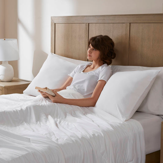
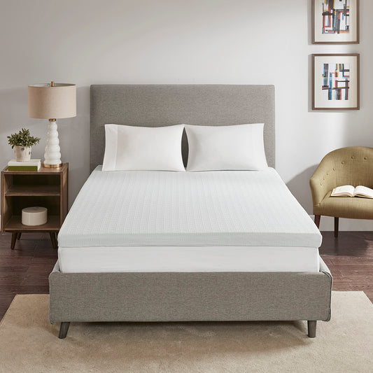
Classics earn their reputation. White and creamy bedding collections act as massive reflectors. They blur the harsh boundary separating mattress from drywall while pushing ceilings upward. Minimalist decorators absolutely swear by them. Just pair those pale layers with slightly textured linen shams. Otherwise, you risk stumbling into a cheap motel vibe.
Beige, Oatmeal, and Warm Neutral Tones
Oatmeal hues are incredibly popular right now. Completely justified, too. Warm neutrals deliver coziness without visually crushing the layout. Cotton collections in sandy beige complement hardwood flooring beautifully. Plus, they inject softness into corners that would otherwise look freezing wrapped in pure snow-white.
Soft Gray and Greige Palettes
Gray translates to contemporary. Greige (that weirdly perfect gray-beige mashup) feels distinctly earthier. Both photograph incredibly well. Try matching them with varied fabric weights. A chunky waffle-knit blanket tossed over sleek quilting works nicely. Modern lovers who appreciate low-key hues—but find stark white somewhat boring—should gravitate toward this family.
Pale Blue and Coastal Tones
Light blues run visual scams on our brains. Snagging hues directly from the sky gives interiors an illusion of distance. Coastal styling means blending airy azure accents alongside soft creams. Narrow guest areas and dimly lit basement setups benefit massively from this trick.
Sage Green and Earth-Inspired Colors
Go read any design blog from the past 36 months. Sage sits right near the top. It soothes frayed nerves, pairs perfectly alongside raw wood accents, and brings nature inside without looking like a hunting cabin. Designers keep gravitating toward muted clays, dusty olives, and pale mossy tones. Those earthy picks keep tight spaces feeling unconfined while pumping up the visual heat.
Bedding Color Combinations That Help Open Up a Room
- Monochromatic is fine. Smart layering is vastly superior. Certain pairings consistently make interiors look noticeably bigger.
- White mixed with oatmeal—super forgiving on tiny footprints.
- Cream and sky blue (giving off a slightly nostalgic, breezy atmosphere).
- Sage greens paired against baked terracotta. Excellent for biophilic decorators.
- Olive green under blush pink. Grounds the layout beautifully.
- Charcoal styling with blush additions looks highly sophisticated, assuming the windows let in decent daylight.
- Vanilla, butterscotch, and deep berry hues.
Dark blue and gray balance each other gorgeously. Save that heavy duo for massive primary suites, though. What about mustard yellow and charcoal? Striking. Bold. But keep it out of rooms smaller than 150 square feet.
How Layered Bedding Affects Room Size Perception
Keep Layers Soft and Balanced
Piling on fabric quickly turns chaotic. Three throws, a folded blanket, massive quilt sets, and two giant euro shams? Congrats, you built a defensive fortress instead of a sleeping surface. Limit yourself to three layers in confined spots. A fitted sheet, one solid comforter, and maybe a single decorative throw folded at the foot. Stop there.
Choose Coordinated Color Tones
Continuity happens when you stay inside a single shade family. Your gaze glides smoothly rather than jolting awake at sharp contrast lines. Arrange tonal pieces. A pale beige coverlet resting beneath a cream quilt and topped by an ivory blanket? That transforms standard Bedding Sets into something remarkably high-end.
Use Texture Instead of Heavy Color Contrast
Craving depth but hate dark shadows? Add tactile elements. Tossing a heavy knit blanket over silky percale duvets builds rich dimension without eating up space. Faux fur touches, linen fibers, cotton sateen fabrics, and bumpy waffle weaves all deliver the visual interest of loud patterns. None of the chaotic noise, though.
Bedding Styles That Make Bedrooms Feel More Open
Minimalist styling heavily features neutral comforters and strict, clean lines.
Scandinavian approaches—think pale oak furniture combined with airy whites or faint grays.
Coastal concepts rely on breathable cotton Bedding in soft blue and cream combinations.
Modern luxury leans hard into muted neutrals stacked with subtle textures. Very much a boutique hotel vibe.
Common Bedding Color Mistakes in Small Bedrooms
Tiny-room regret usually stems from obvious blunders. Let's review:
Throwing dark textiles into terribly lit spaces. The walls instantly cave inward.
Massive geometric shapes or giant florals printed across oversized blankets.
Three intensely bright accent pillows screaming for attention simultaneously.
Suede or heavy velvet layers actively absorbing every single photon.
Ignoring wall undertones. Slapping icy blue blankets against warm beige drywall? Rough look.
Tips for Choosing the Right Bedding Color Palette
Consider your windows first. Saturated hues work wonderfully inside sun-drenched spaces. Gloomy corners desperately need paler alternatives.
Always check drywall undertones. Cool paint requires cool fabrics. Warm backgrounds demand warm textiles. Mixing color temperatures almost always looks awkward.
Striking a balance between aesthetics and comfort takes effort. Visually airy spaces that physically feel freezing fail their main purpose. Throw down a chunky knit blanket or textured shams to fix that.
Swap things out seasonally. We've seen exactly how rotating to breezy palettes in mid-July prevents visual fatigue. Bring back those rich butterscotch and berry tones around November.
Stuck on a decision? Ask an extra set of eyes before swiping your card. Sometimes a quick chat saves you the hassle of printing return shipping labels.
FAQs
What bedding color makes a bedroom look bigger?
Pale grays, soft sky blues, oatmeal, and classic ivory all push walls backward visually. Light-reflecting neutrals generally perform best.
Are dark comforter sets bad for small bedrooms?
Not inherently. They just require strategic support. Deep hues function fine if your drywall is pale, the windows are large, and the remaining decor stays aggressively minimal.
What bedding colors create a calming atmosphere?
Soft beige tones, washed-out blues, sage greens, and muted neutrals. Lowering visual stimulation directly helps your overactive brain shut down at midnight.
Should bedding match wall color exactly?
Do not perfectly match them. Exact color-matching flattens the environment. Try selecting linens slightly darker or a shade lighter than your paint.
How can bedding make a room feel more luxurious?
Tactile variety creates that expensive illusion. Layered fabrics, oversized euro pillows, and carefully folded throws at the footboard project serious luxury. Even on tight budgets.
Do patterns make small rooms feel smaller?
High-contrast, massive patterns definitely do. Tiny prints utilizing quiet, tonal colors won't cause spatial panic.
Final Thoughts: Using Bedding Colors to Transform Bedroom Space
You don't need a fresh coat of paint to alter spatial perception. Earthy greens inject calm. Soft neutrals physically stretch the floor plan. Strategic layering builds coziness without adding clumsy weight. Redoing a cramped guest room? Upgrading a primary suite? Mindfully chosen palettes turn tight boxes into breathable, expansive sanctuaries. Match fabrics to your specific sunlight situation. Then watch the walls melt away.