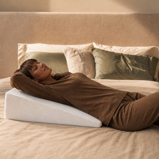
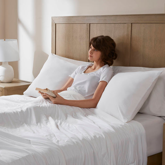
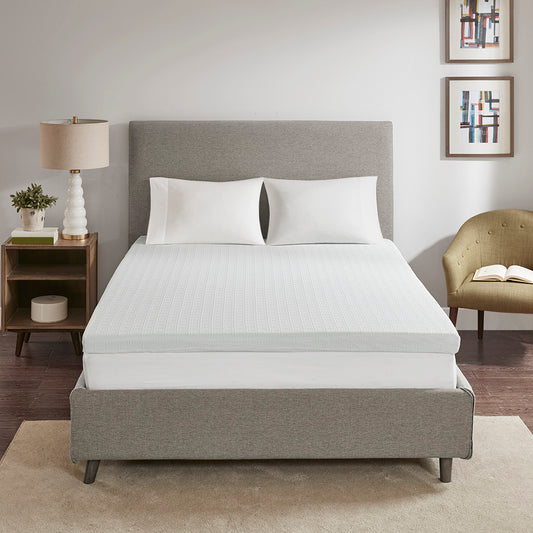
Step inside a space draped in quiet oatmeal or sun-baked sand. You physically relax. Shoulders loosen up. Paint those same walls hot pepper red. What happens? Your mind jolts awake. Sure, it looks striking, but sleep won't come easy. This distinct reaction runs deeper than mere chance, tying back to visual psychology alongside the magnetic draw of carefully styled Bedding. Magazines push these muted spaces heavily, largely ignoring fleeting fads to focus on pure comfort.
Muted tones offer tired eyes a soft landing pad. Nubby fabrics do the heavy lifting from there.
The Psychology Behind Neutral Bedroom Colors
Why Soft Colors Feel Less Stimulating
Loud pigments demand constant engagement. They zap the optic nerve much like an endless stream of buzzing text messages—nagging, relentless, annoying. Earthy shades skip this entirely. Because taupe and washed ivory hum at a visual whisper, your overloaded nervous system finally powers down. Put simply, warmer off-whites bounce back a much gentler fraction of light. Exhausted retinas desperately need this exact optical break right around 10:14 PM.
How Neutral Colors Create Visual Balance
Toss four contrasting shades into one sleeping area, and you accidentally build a stressful jigsaw puzzle. Brains naturally try figuring it out. A hushed design scheme flips this script entirely by offering far less visual clutter to mentally categorize. When nightstands blend effortlessly with wall art and duvets, no single item screams for dominance. Spaces suddenly feel remarkably neat (even if yesterday's clothes remain piled on a chair).
The Connection Between Calm Spaces and Better Sleep
In our experience, folks swapping loud blankets for subdued Bedding Sets report an odd phenomenon after about six days. Their square footage magically expands. Obviously, the walls stayed put. Muted greige and clay hues bring immense psychological weightiness, anchoring the mind wonderfully. Falling unconscious by 11:43 PM on a stressful Tuesday actually becomes a realistic goal.
Why Neutral Bedding Works So Well in Bedrooms
Bedding Becomes the Room's Largest Visual Element
Peer through any primary suite doorway. The mattress dominates immediately. Taking up around 38% of your sightline, this furniture piece acts less like a mere accessory and much more like a massive focal canvas. Snag screaming neon sheets, and chaos ensues. Opt for subdued linens instead. Calmness washes over the entire footprint.
Neutral Bedding Reflects Light Better
Pale oats and sandy whites grab morning sunshine, scattering it beautifully across dark corners. Inky textiles simply absorb those precious rays. Dealing with a single pathetic east-facing window? Swapping to pale covers instantly transforms a gloomy cavern into a breezy sanctuary. Fancy boutique motels abuse this specific illusion constantly. Resort designers strictly enforce strict ivory sheet policies for exactly this reason.
Neutral Bedding Feels Timeless
Fad colors expire shockingly fast. That wild mustard-yellow quilt you bought three years ago already feels tragically ancient. Stone-washed flax sheets? Always stylish. Always serene. Updating these foundations requires nearly zero effort. Toss a heavy knitted blanket across the footboard during January, swap cases come April, and boom. Brand new vibe. Zero expensive renovations required.
Popular Neutral Bedding Colors That Create a Relaxing Atmosphere
Sand and Beige Tones
Khaki-tinted fabrics perform an intriguing magic trick. They inject coziness into freezing north-facing spaces while avoiding any suffocating heaviness. Basic beige feels incredibly stable. Smush them together, and you get a sophisticated beachside energy. Skip the tacky plastic starfish, though. Think weathered cedar shingles somewhere near Nantucket instead.
Ivory and Soft White Bedding
Pure starkness causes problems. Brilliant snow-white often mimics a terrifying hospital ward. Ivory fixes this beautifully by holding a microscopic drop of warm yellow. Sunlight hits it differently. It invites you to nap rather than operating on you.
Taupe and Oatmeal Shades
Many interior decorators worship taupe privately. Bridging the awkward gap between chilly blues and warm browns, this versatile muddy hue respects dark walnut dressers beautifully. Oatmeal lives nearby on the swatch book. Expect a homier, subtly farm-inspired energy from it.
Soft Gray and Greige Palettes
Smashing silver into tan birthed "greige." This hybrid delivers upscale hotel vibes minus the freezing-cold undertones of flat cement. Monochromatic styling absolutely begs for it. Throw a mushroom-colored quilt across stark cotton, toss down a textured runner, and visual depth explodes. You won't miss neon pink at all.
Earth-Inspired Accent Colors
Going 100% beige sometimes creates a dreadfully boring cardboard box. Small hits of washed sage, muddy terracotta, rust, or faded denim rescue the layout. Grab one single velvet pillow. Find a weirdly shaped clay lamp. Little grounding pops of nature keep your zen hideaway from flatlining.
Why Texture Matters More Than Bright Colors in Neutral Bedrooms
Pigment rarely dictates a room's success alone. Tactile variation usually steals the show.
Layered Bedding Creates Depth
Heaping on thin coverlets and heavy faux-furs transforms a sad, flat mattress into an inviting marshmallow. Contrast is everything here. Slipping crisp percale beneath a violently bumpy waffle weave forces the eye to pause. Shadows form in the fabric dips. Suddenly, monochromatic styling looks stupidly expensive.
Linen and Waffle Weave Textures
Wealthy influencers spend fortunes faking the wrinkled charm of genuine flax linen. Washing it repeatedly only makes it better. Waffle knits drag tiny, shadow-catching squares into the mix. Combine them properly, and blandness vanishes entirely.
Mixing Materials for a Cozy Look
Basic woven percales deliver severe starchiness. Heavy yarn throws crank the heat. Shaggy pelts drape beautifully across footboards while adding massive physical weight. Velvet cushions, bumpy shams, coarse wool rugs, and slick wood floors gang up to replace neon dyes altogether.
Small secret: whenever a beige sleep space feels aggressively dull, missing texture is the culprit. Never the paint job.
Neutral Bedroom Styles That Feel Especially Relaxing
Minimalist Bedroom Design
Bare surfaces rule here. Zero clutter allowed. You pick a strict two-tone textile limit, trusting empty air to speak volumes.
Japandi-Inspired Bedrooms
Fusing Tokyo's discipline with Stockholm's coziness births the "Japandi" aesthetic. Think low-slung oak frames. Rice paper lighting. Jute flooring. Blankets normally stay strictly within gravel or dried-wheat territories.
Coastal Neutral Bedrooms
Beach house decor previously required obnoxious navy anchors plastered everywhere. Modern seaside vibes prefer subtlety. Sun-bleached timber, sea-foam hints, chalky whites, and driftwood outclass cheap nautical gimmicks easily.
Scandinavian Bedroom Styling
Nordic layouts exist purely to survive brutal, sunless winters. Milky creams mingle with pale pigeon grays. One massively oversized knit blanket. A single framed pencil sketch. Boom. Done.
Common Mistakes That Make Neutral Bedrooms Feel Boring
- Matching the walls, sheets, and nightstands perfectly. A massive rookie error.
- Running totally slick surfaces. Smooth cases next to smooth blankets offer zero visual friction.
- Bleaching everything. Too much blinding white feels suspiciously like an oral surgery clinic.
- Blasting daylight-temperature overhead bulbs ruins careful color curation instantly.
- Neglecting finishing touches. You need one weird clay pot, a dark mahogany tray, or maybe an ugly vintage frame.
Fixing these blunders costs almost nothing. Swap a lightbulb. Toss down a frayed blanket. Buy a cheap thrift-store mug.
How to Add Interest to a Neutral Bedroom Without Bright Colors
Stack materials ruthlessly. Shove a heavy coverlet beneath a poofy duvet. Fold things irregularly.
Drag the outdoors inside. Unfinished oak, braided rattan, rough stoneware, and dried branches age wonderfully.
Inject muddy tones cautiously. Faded olive and baked terracotta belong in tiny, deliberate splashes.
Toss your bright daylight bulbs in the trash. Anything above 2800K violently murders a cozy atmosphere. Stick to amber-hued lighting.
Ready for a sleepy-time upgrade? Reach out so our design geeks can craft a heavily layered layout respecting your specific wallet size.
FAQs
Why do neutral bedrooms feel more relaxing?
Subdued pigments refuse to scream at your corneas. Because the environment reads as completely silent to your optic nerve, brainwaves slow down.
What neutral bedding colors are most popular right now?
Shoppers constantly hunt down dried oat, putty, warm beige, and muddy sand. Pale slate hasn't died off either. It crushes in starkly modern lofts.
Can neutral bedrooms still feel cozy?
Without a doubt. Snugness stems from lighting and fabric weights. A brown room packed with thick wool blankets and amber bulbs destroys a neon yellow room sporting cheap, paper-thin cotton.
How do you keep a neutral bedroom from looking boring?
Clash your fabrics on purpose. Shove wrinkled linen against stiff cotton. Toss a nubby throw over a puffy comforter. Physical bumpiness cures visual boredom every single time.
Are neutral bedrooms still trending?
Heavily. Earth-baked hues keep dominating retail floors. They look phenomenal on camera, sure. But mostly? They just feel exceptionally nice to sleep inside.
Is linen worth the extra cost over cotton?
Honestly? Depends on your sleeping style. Flax fibers breathe aggressively while delivering that sloppy-chic aesthetic. Basic cotton remains a brilliant financial move if severe crispness sounds better to you.
Final Thoughts
Ditching bold paint doesn't sentence you to a depressing beige box. It forces you to master layers. Serenity requires dim bulbs, knobby fabrics, and washed-out shades working together. Rip one element away, and the spell breaks. Nail all three? You just built a sanctuary guaranteed to look incredible 73 months from now. Whether you copy an upscale resort or chase a breezy shoreline vibe, your primary blankets shoulder the burden. Grab nubby materials. Hunt down eye-soothing shades. Dim the nightstand switch. Then, just get into bed.